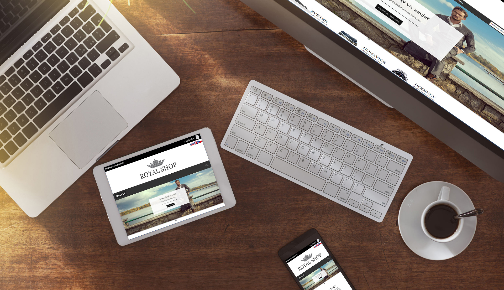
Responsive graphic design
Your e-shop adapts to the resolution of the device from which the user comes, giving you much more comfort. Nowadays you can find many responsive pages, but few such e-shops. This way you can gain a competitive advantage by adding valuable points to Google for optimizing for your mobile device's placement in search.
Logo insertion
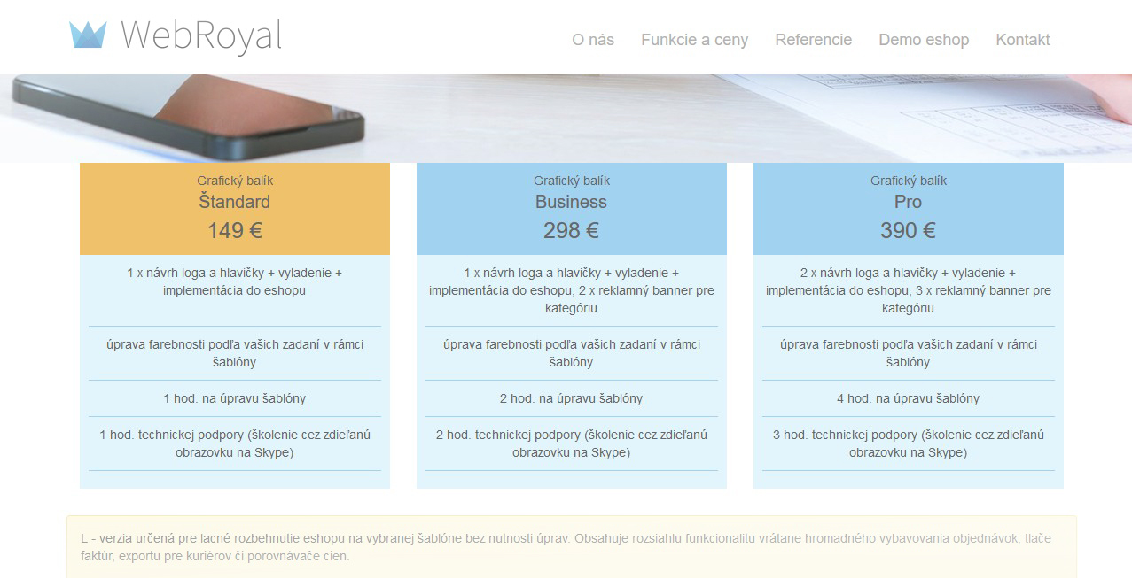
Part of our clients already have their logo. In this case, within the license price, respectively. rent it, we will adapt it for use in the system. If you don't have one yet, we will create a proposal for 80 € and deliver it in a curved format.
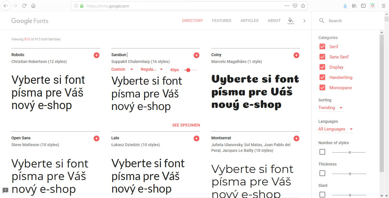
The ability to implement fonts from https://fonts.google.com/
Possibility to insert graphic icons for categories
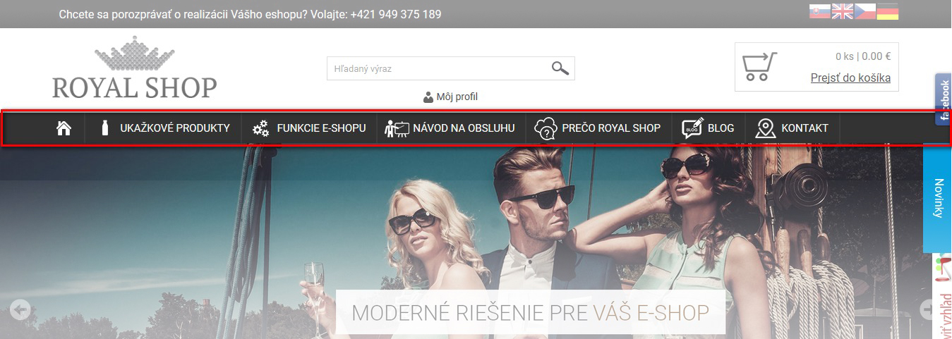
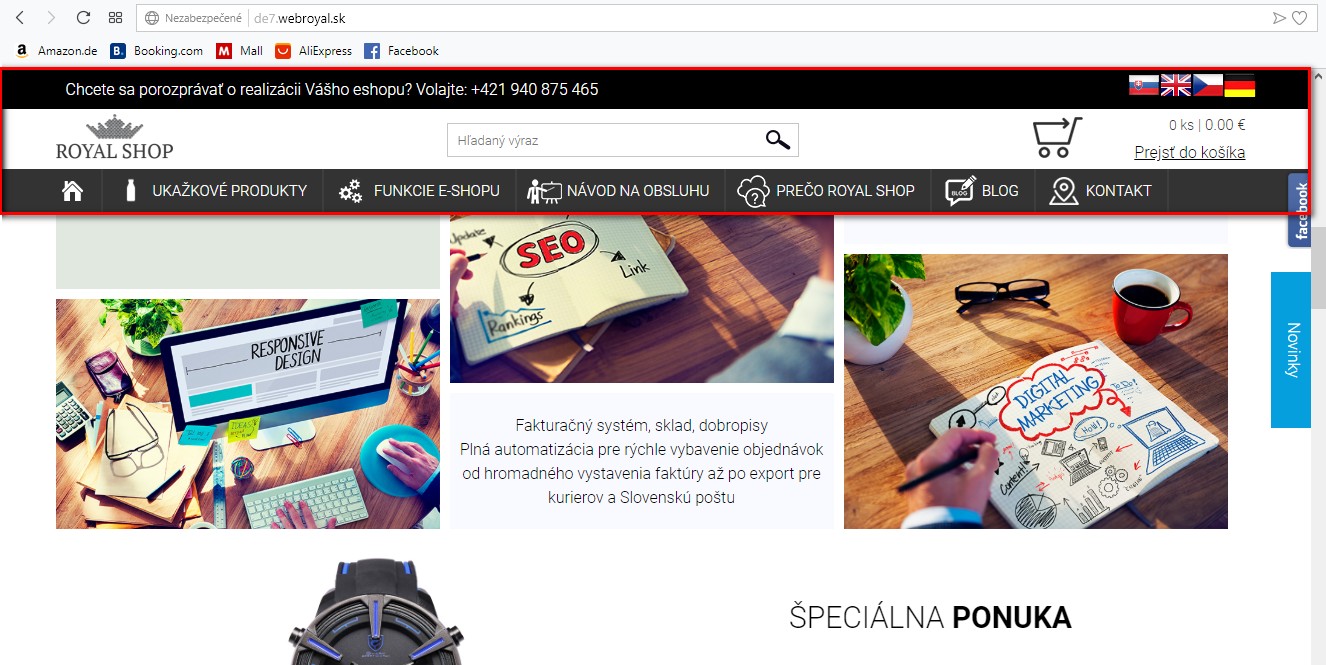
Possibility to fix eshop headers
You have the option to turn on website header fixation. This will decrease as you move down and remain at the top of the browser window. It allows quick access eg. to cart, search or article.
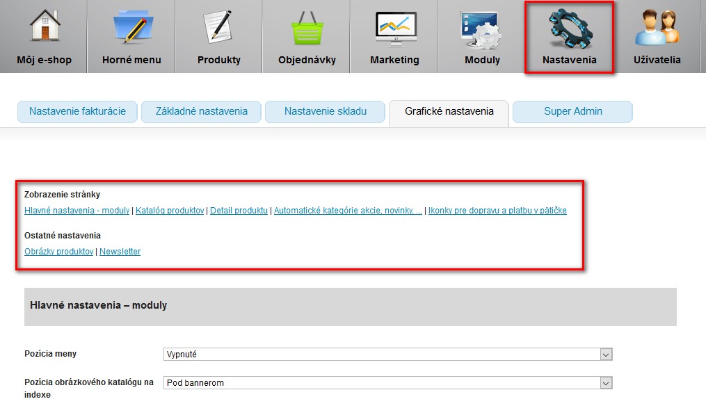
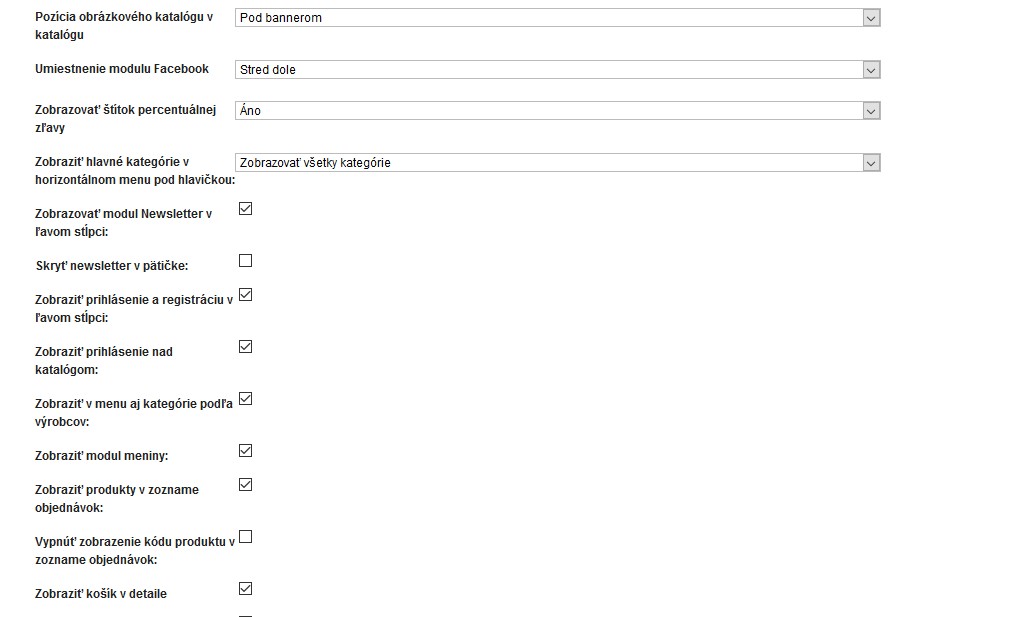
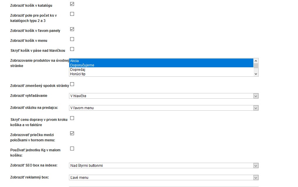
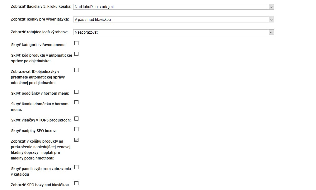
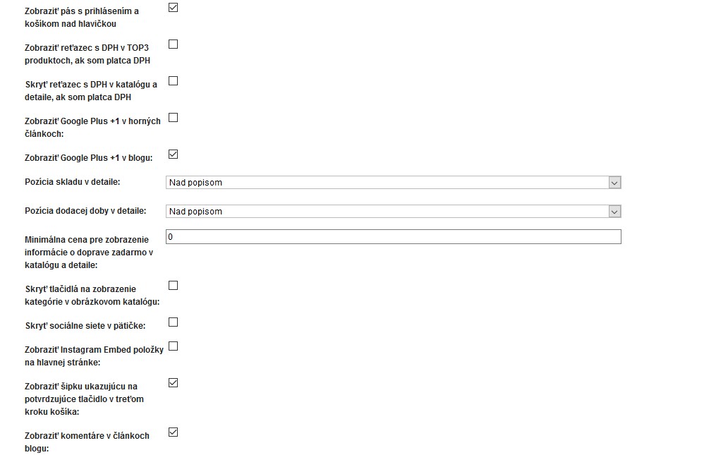
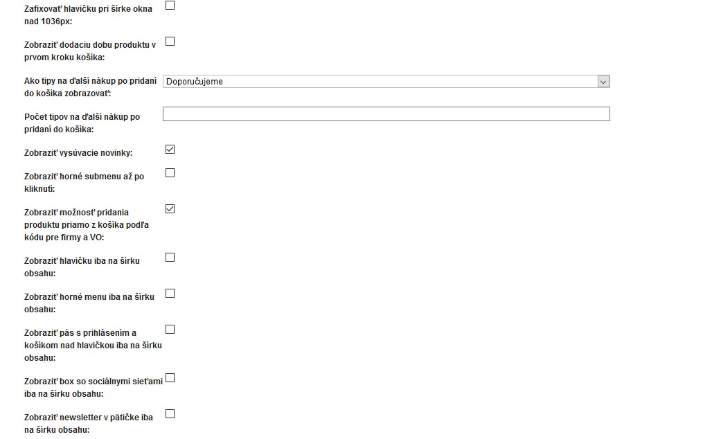
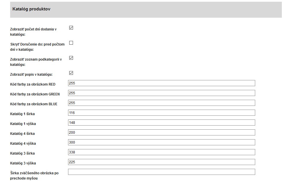
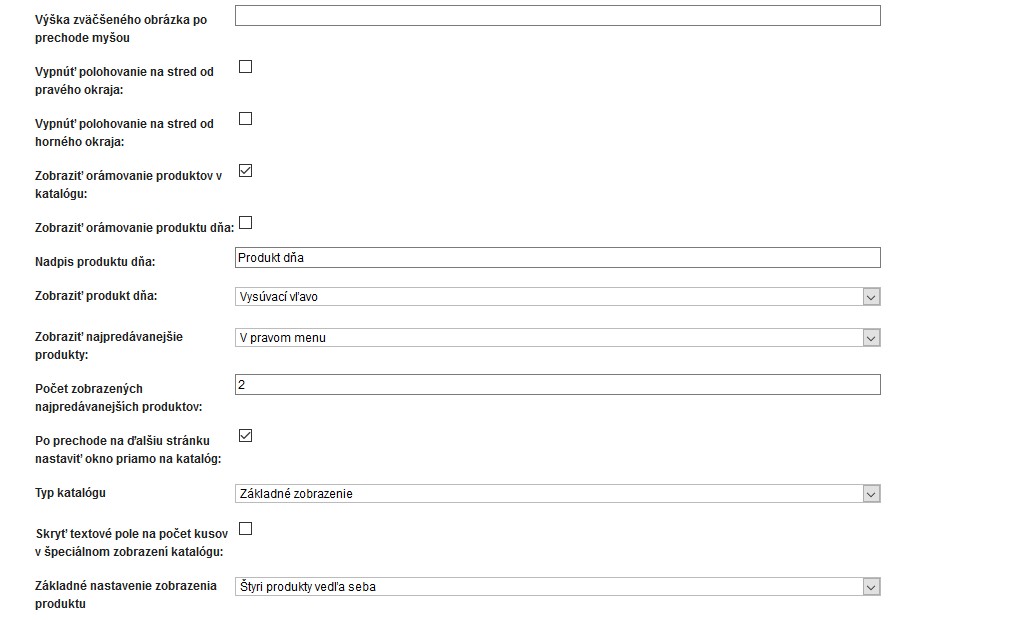
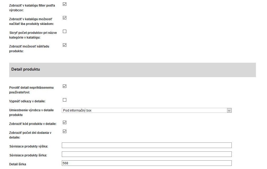
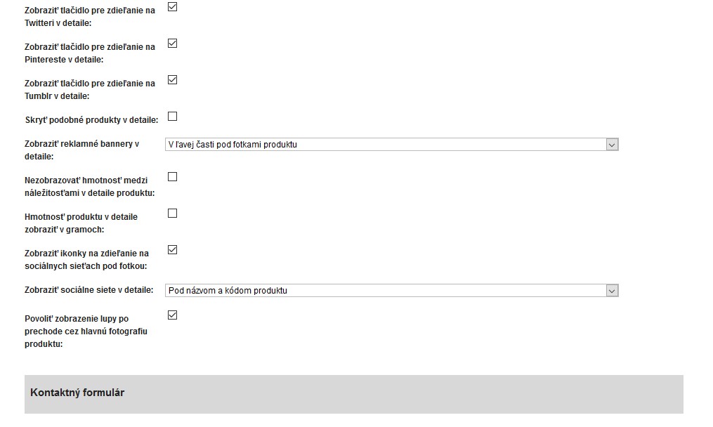
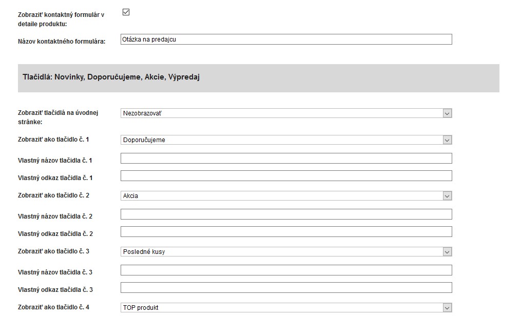
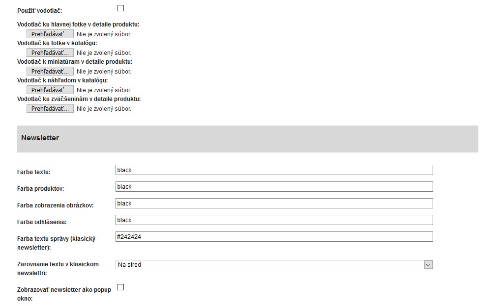
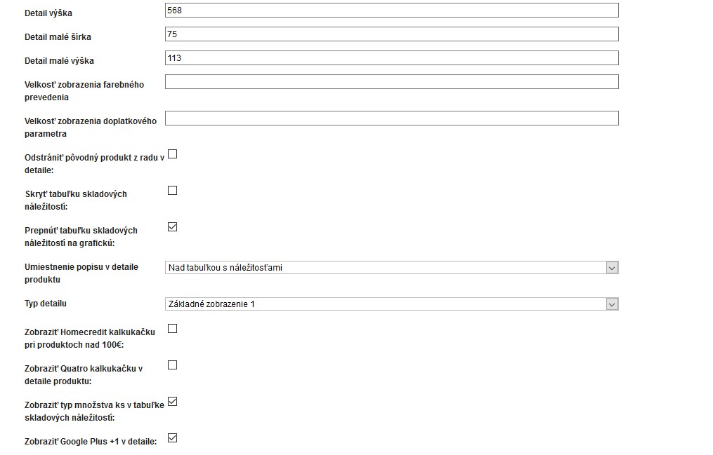
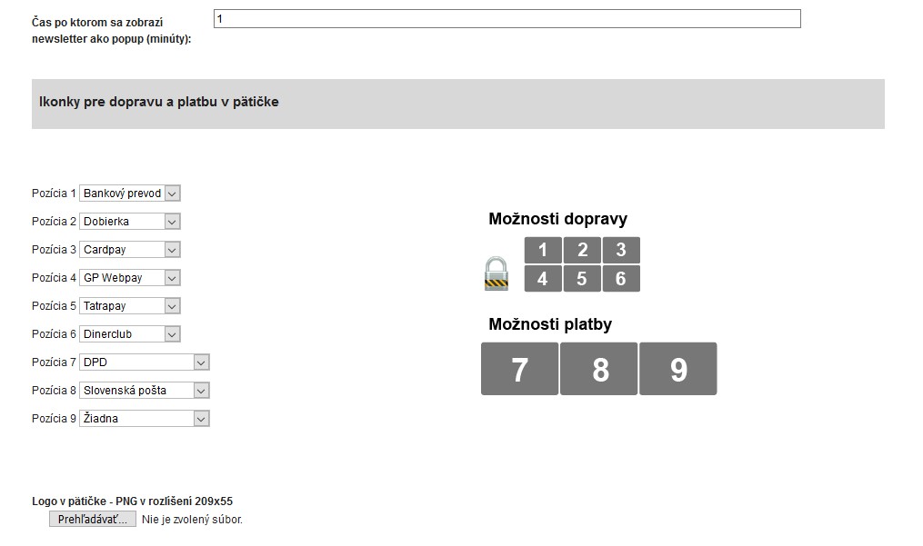
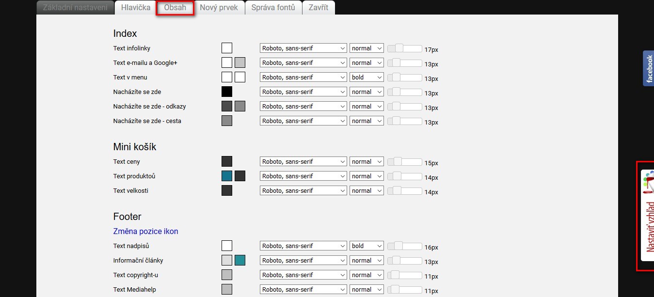
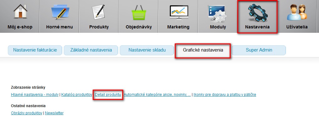
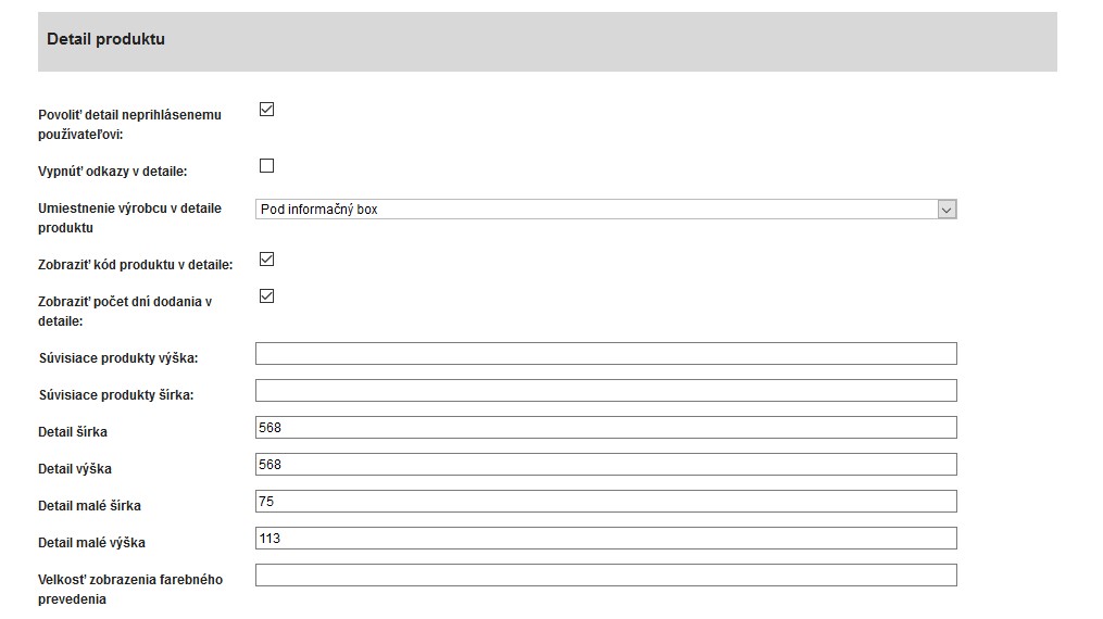
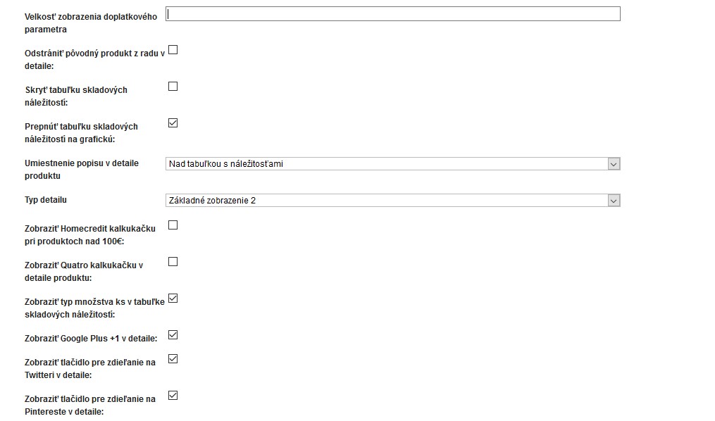
Possibility to influence the appearance through administration:
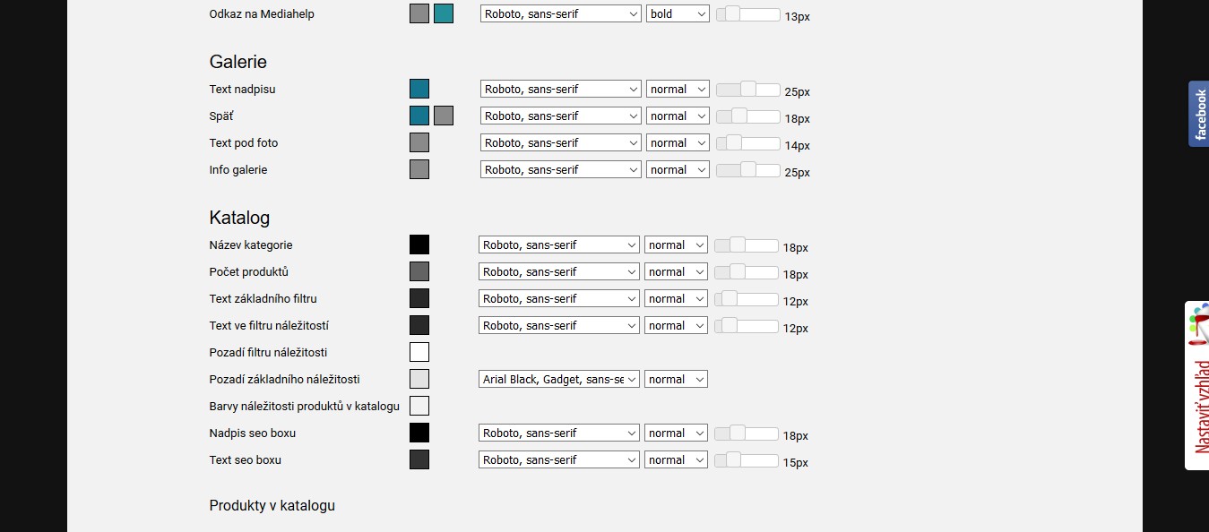
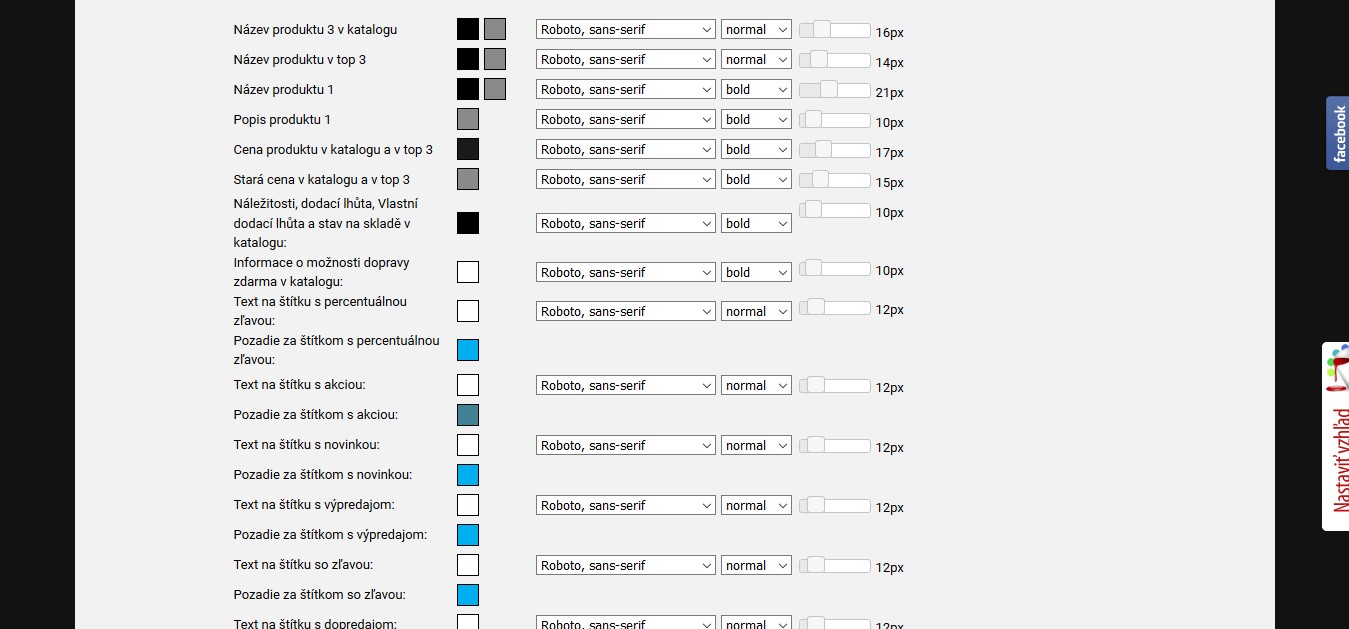
Vytvorenie grafického návrhu
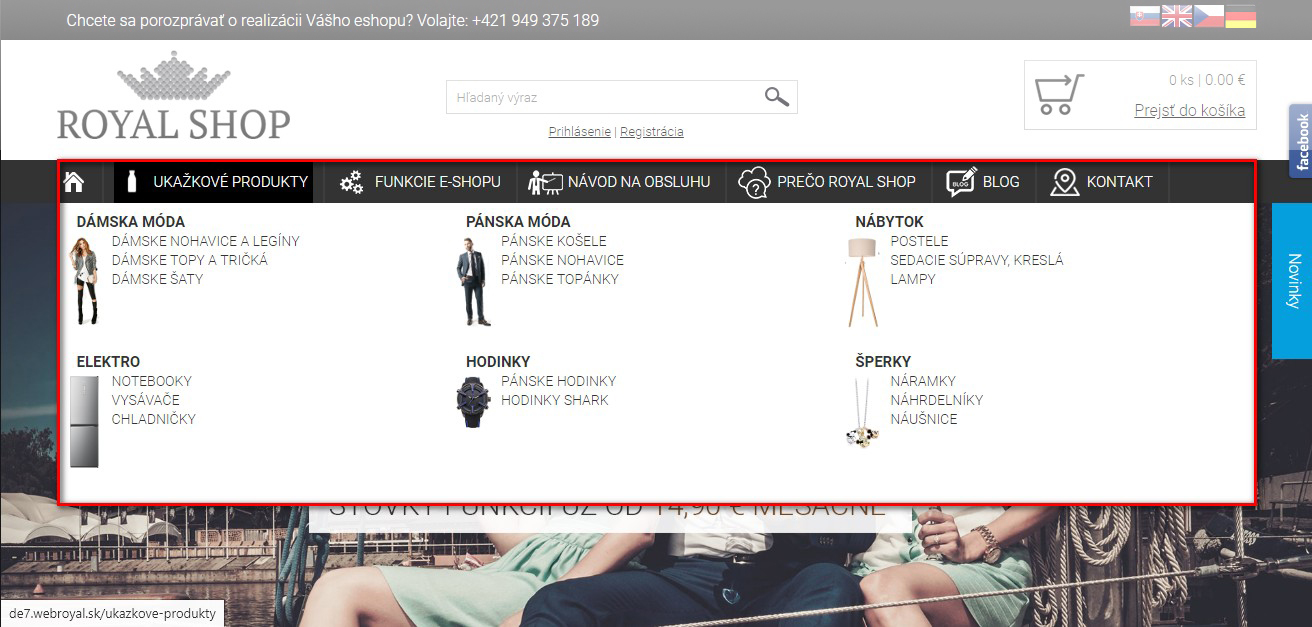
Display submenu with images
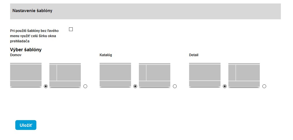
Layout selection option
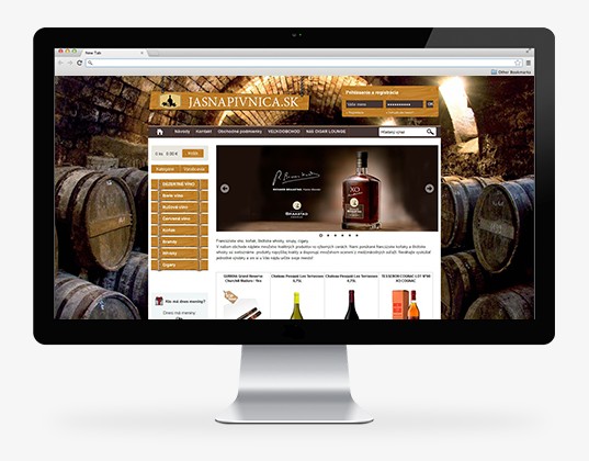
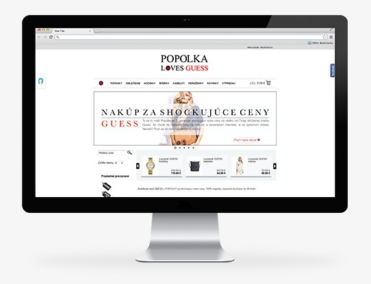
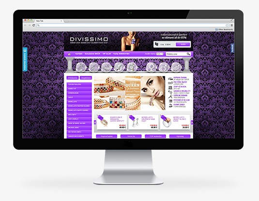
You can see sample e-shops and choose which one yours should most like. Then we start it and edit it as part of the graphic package or additional works. The higher the package, the more editing we allow.

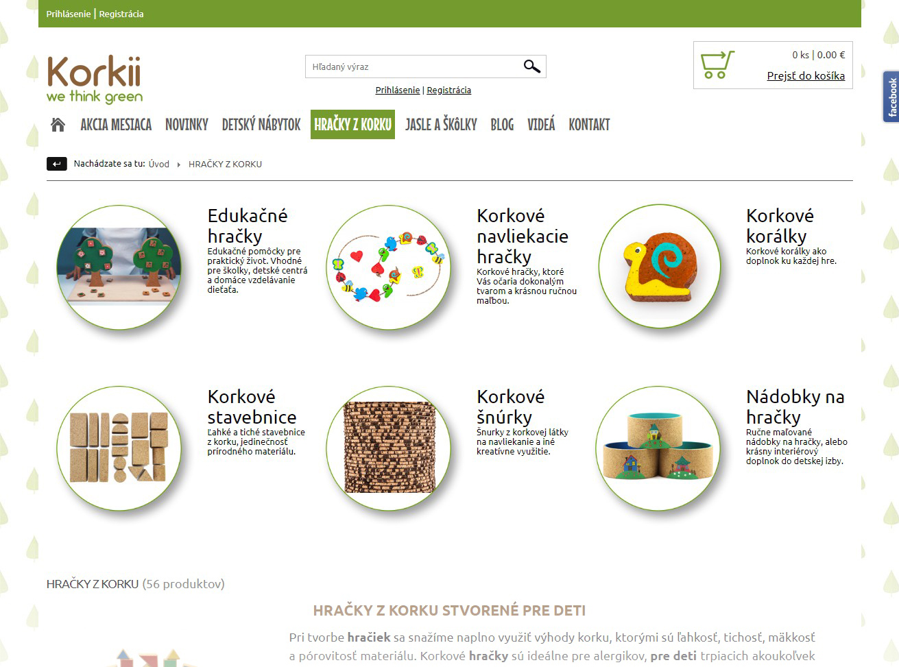
Picture Categories
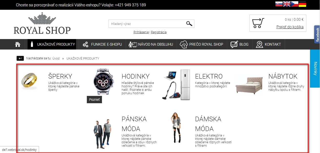
Image categories can be designed in different ways.
Choice of different product detail types
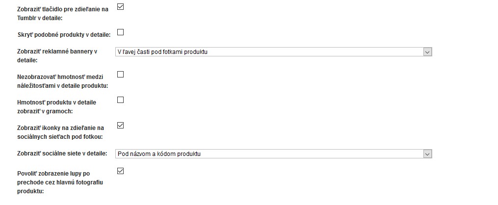
Option to set banner placement within the page
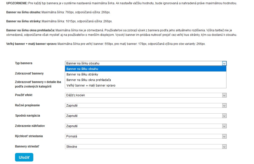
Wide graphics options
